
Galactic Graphics
Galactic Graphics is a T-shirt company that focuses on illustration driven merch for various fandoms. The concept came from a problem I constantly face of me shopping for merchandise from my favorite shows, but seeing a lot of of unattractive or tacky items for the media I enjoyed.
Instructor: Jackie Jensen
Project Year: 2023


I started my design journey with exploring the Galactic Graphics logo. Out of all my explorations, my peers and I agreed that the moon mascot reflected both the cartoon driven nature of the brand and was a fitting icon for a company called “Galactic Graphics.” I settled on the moon mascot and switched its view from looking upward to looking towards the logo.
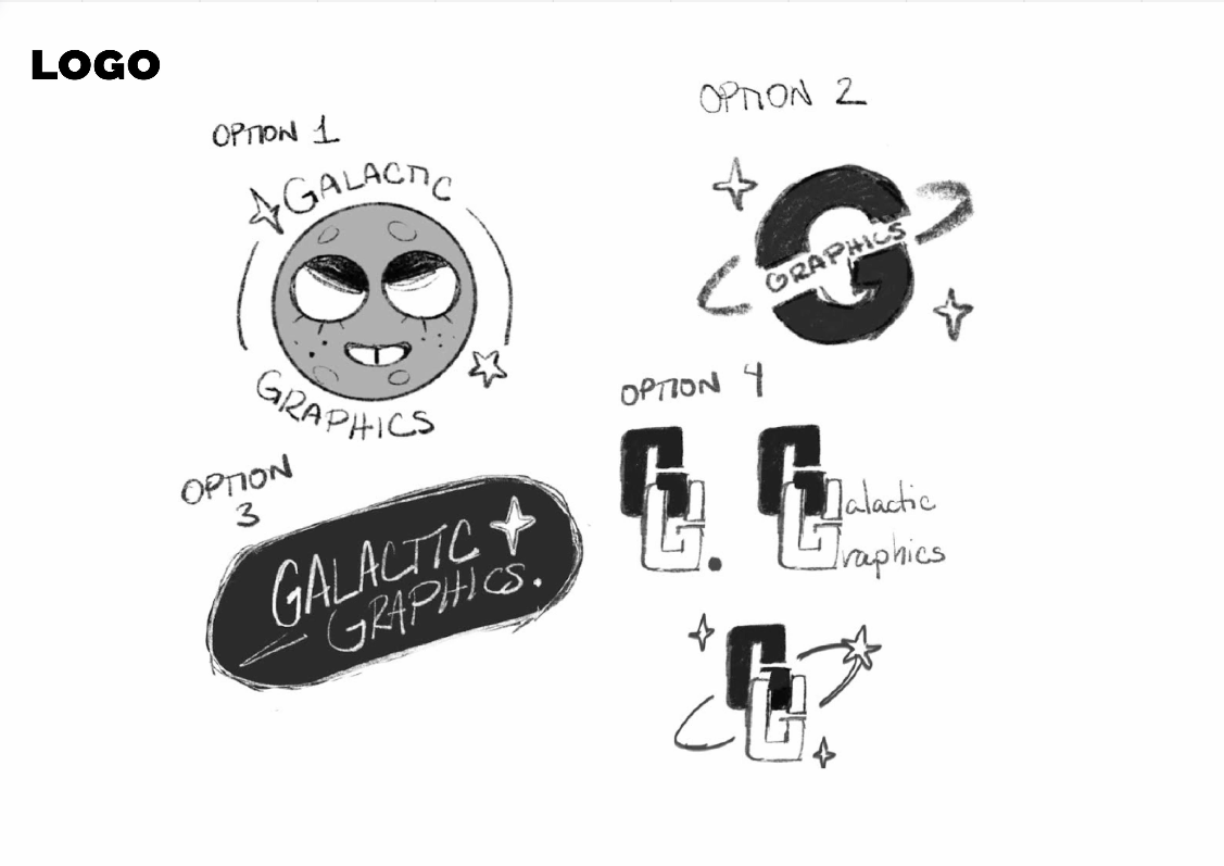


For type, I explored bold fonts that were expressive in their simplicity. However, I also found myself attracted to a handwritten font as shown as it reflected a sort of doodle-like style which responded well with the style of my illustrations. I decided a combination of strong and condensed fonts with the cursive handwritten font fit well with my brand style.


After the hard work of fonts and logos, I finally got to the most fun part of my brand: the illustrations! I had originally wanted the illustrations to remain black and white, but after initially pitching my test sketch on mockups, I decided that color would really bring my designs home. This really helped me not just in deciding on more designs but also in creating fun, space themed icons for my e-commerce site.


I chose to illustrate shirts inspired by Dorohedoro, Berserk, Scott Pilgrim, The Legend of Zelda, TinTin, and Astroboy. It was a fun challenge to illustrate work with one style that spanned not just media from cartoons to graphic novels but also time periods. Galactic Graphics understands that being a nerd includes also enjoying older media such as TinTin and Astroboy along with contemporary media!
In exploring my buyer persona, I considered what other people interested in merch would want out of a brand based around fandoms. In making Brandon, I thought about how my designs would be worn in public. Would I want them to be so easily recognizable similar to how already existing merch is? I thought maybe not!
This led to me deciding on a brand ethos of “if you know, you know” where on first sighting the designs of my shirts, what media they are from may not be immediately recognizable. But to fans of the media, they’re recognizable. I knew I was using this idea effectively when my classmates called out the characters I was drawing without me having to explain where they’re from and those who weren’t as familiar saying that they loved the designs for the illustrations.


For my website, I wanted a minimal layout so that my illustrations could take center stage. I also wanted my site’s UI to have the space illustrative icons. To display my products, I brought in some black and white photography for my icons to react to. I also wanted to include links that provided more insight into what media the designs were from, in case I had users who were shopping based on design alone. That way everyone feels included and I might even help grow some fandoms!


For our promotional campaign, I wanted to have a unique spin on our illustrative aesthetic by using paper and sticker textures. This provides a fresh look to the Galactic Graphics style while also calling back to our cartoony, traditional art based roots.


Overall, I learned that I felt that my branding and art direction was very successful. Within this assignment, I was one of the few students that decided to illustrate every design on top of building a brand identity. However, what initially seemed overwhelming actually ended up being simple with proper scheduling and staying committed to each specific task instead of sporadically jumping around. I even had people asking for the shirts to be made into real products that they could buy!

